September 29, 2026
Assembly Instruction Analytics: Track Where Customers Get Stuck
.png)

Quick Answer: Assembly instruction analytics is usage data collected from a digital assembly manual, showing how customers move through the steps in practice. It typically includes completion rates, drop off points, time spent per step, and backtracking behavior, giving product and documentation teams a way to find and fix the exact steps causing confusion or returns.
A manufacturer can know that customers are struggling with assembly without knowing exactly where the problem begins. Maybe support keeps fielding the same question about one product. Maybe returns are getting coded as defects even though the units test fine. Maybe a review mentions confusing instructions, or installers keep asking for clarification on the same part of the process.
Those signals tell a team that something is wrong. They rarely say where the assembly experience actually breaks down, and a printed manual or a static PDF cannot fill that gap, because it never reports back on how it performed. Assembly instruction analytics is the alternative: usage data collected from a digital manual that shows how people actually move through the steps, not just what the steps say.
The goal is not to collect data for its own sake. It is to find the specific steps worth investigating, work out whether the problem sits in the instructions or the product itself, and make a change that can be checked against real behavior afterward.
Assembly instruction analytics is the analysis of how users interact with a digital assembly manual to find friction, difficult steps, drop-off points, and opportunities to improve the experience. For a manufacturer, that provides a level of visibility that a printed document simply cannot offer.
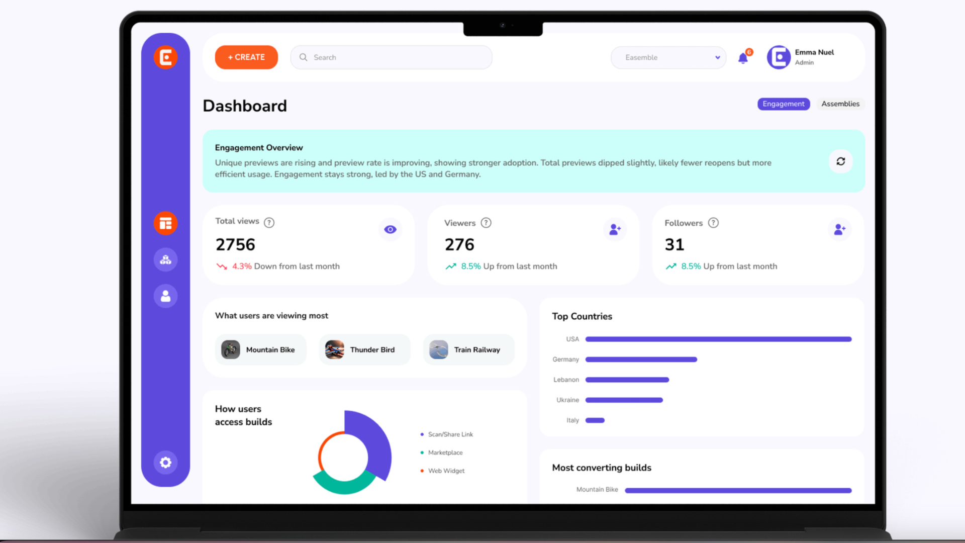
An analytics-enabled manual can show how many users complete the assembly, where they abandon a step, how they move between steps, how much time they spend on each one, and where they go backward through the sequence. Easemble's analytics feature is built around exactly this kind of visibility, tracking completion rates, drop-off points, step level engagement, time spent per step, and backtracking, then surfacing the pattern through a heatmap so a team can see at a glance which steps are generating trouble.
None of that is useful on its own. It becomes useful the moment it leads to an action, such as investigating whether a step where users consistently linger longer than expected has an unclear visual, an awkward sequence, or a physical assembly that is simply harder than it looks on paper.
Printed manuals and PDFs still have a place. They distribute easily, archive well, and some customers and regulators still expect a printable option. The limitation is not the format itself. It is that once someone opens a PDF or picks up a printed booklet, the manufacturer has no way to see what happens next: which instruction caused confusion, which step got revisited, or where a customer gave up.
That leaves a gap between documentation quality and documentation performance. A support ticket suggests someone had trouble. A return suggests the assembly did not get finished. A review might mention a confusing manual. None of those signals reliably points to the exact step where the difficulty started, which is the information a documentation team actually needs before it can fix anything.
User interaction tracking is most useful when it answers a specific question about a specific step, rather than a general sense that a manual is confusing.
Step level engagement shows how users interact with individual stages of the process. A step that draws noticeably more interaction than the ones around it is not automatically poorly written, some operations genuinely need more attention, but an unusual pattern is worth a closer look.
Drop-off points mark where users stop progressing altogether. This is one of the clearest signals available: if a large share of users reach the same stage and then stop, the team has one specific place to investigate rather than a whole manual to review on the strength of a vague complaint.
Time spent per step adds another layer. If most steps move quickly but one consistently takes far longer, that gap points to friction, whether the cause is a genuinely complex operation, unclear wording,or an illustration that does not communicate orientation well. Time is a signal worth investigating, not proof that a step is defective.
Backtracking often reveals a different kind of friction: a user moving repeatedly back to an earlier step is usually looking for information the current step assumed they already had, a part number, an orientation cue,or context introduced too early to still be remembered.
A completion percentage alone does not capture any of this. The Nielsen Norman Group's research on success rate as a usability metric makes the point directly: a success or completion rate says whether users eventually got there, not why some of them struggled or how much difficulty they had along the way. Two manuals with the same ninety percent completion rate can represent very different experiences, one where most people breezed through and one where most people succeeded only after real friction on a single step. Step level and drop off data are what separate those two cases.
Analytics earns its keep when it becomes a repeatable investigation rather than a report nobody reopens.
One of the easier mistakes here is assuming every difficult step is a documentation failure. Sometimes the instructions are unclear. Sometimes the product itself is genuinely hard to assemble. Sometimes both are true at once, and analytics on its own cannot settle which.
What it can do is hand a specific pattern to the right people. If the same step shows unusual engagement, repeated backtracking, and long completion times, that gives product, QA, and documentation teams something concrete to investigate together, whether the underlying issue turns out to be part identification, manufacturing tolerances, sequencing, or wording, rather than a general complaint that customers are having trouble with the product.
It can help a team investigate avoidable causes, but it is not a guarantee, and the distinction between correlation and causation matters here. A high drop-off at one step does not prove that step caused a specific return. What it does is give a team a place to look, and if that same step also shows up in support tickets and customer reviews, the combined evidence becomes far more convincing than any one signal alone.
The clearest case is a return coded as defective when the unit itself tested fine; the customer simply could not finish assembly, a cost that a printed manual has no mechanism to prevent because there was never any visibility into the moment it happened. Easemble's ROI calculator is built around that same reasoning, letting a team estimate potential savings across printing, support, and returns using its own numbers rather than a generic industry figure.
For a product or documentation manager evaluating a platform, the useful question is whether the available data can answer a real assembly question, not how many metrics the dashboard displays.
Easemble's analytics track completion, drop-off points, navigation paths, step level engagement, time spent per step, and backtracking, and surface the pattern visually so a team can identify a bottleneck without digging through raw numbers. Easemble's manual creation and publishing workflow shows where that fits into the rest of the process: once a step is flagged, a team can revise it and publish the change from the same platform rather than waiting for a new print run.
This is already in production use outside a lab setting. In the TurfHound success story, Easemble describes analytics covering manual views, completion, time spent, step level engagement, and drop-off, which TurfHound used to understand how installers actually interact with its instructions and find opportunities to keep improving the installation experience. The same underlying capability applies whether the audience is a consumer assembling a product at home or an installer working through a commercial setup.
Analytics is not valuable because it produces a report. It becomes valuable the moment someone on a documentation or product team uses it to decide what should change next.
The analysis of how users interact with a digital assembly manual, including completion rates, drop off points, navigation behavior, step level engagement, time spent per step, and backtracking, used to find where the assembly experience is causing friction.
Look for unusual drop offs, repeated backtracking, and long time spent on a specific step, then compare that pattern against support tickets, return reasons, and customer feedback before concluding the manual is at fault rather than the product.
Yes. An analytics enabled manual can show exactly where users stop progressing or repeatedly revisit a step. Easemble's analytics include completion rates, drop off points, navigation paths, step level engagement, time spent per step, and backtracking.
Web analytics track behavior across a website or app. Assembly instruction analytics track how someone moves through a specific set of physical assembly steps, which is a narrower but more directly actionable data set for improving a manual.
It can point to the instruction steps most likely contributing to recurring questions, which gives a documentation team somewhere specific to start. It does not prove that a step caused a given ticket, so it works best alongside support and customer feedback.
Yes, on a platform where instructions can be revised and republished from a single source before a scheduled reprint. The value depends on being able to act on the data quickly rather than waiting for the next version to be finalized regardless of what the data shows.
The real shift here is moving from asking whether a manual looks good to asking where users are actually struggling and what evidence explains why. A printed manual can communicate the intended process, but it says nothing about what customers do with it. Completion rates, drop off points, step level engagement, time on step, and backtracking, read alongside support tickets, return reasons, and product testing, start to build a picture that no single source could produce on its own.
The useful outcome is not a better dashboard. It is a better decision: find the friction, investigate the cause, make a specific change, and measure whether it worked. That is what turns an assembly manual from a document published once into something a team can keep improving.